Why Not?
Project Goals
Using User Experience principles, the aim of this project was to produce a mobile application to solve an existing problem. My team and I chose to focus on the lack of motivation that comes with various mental health conditions.
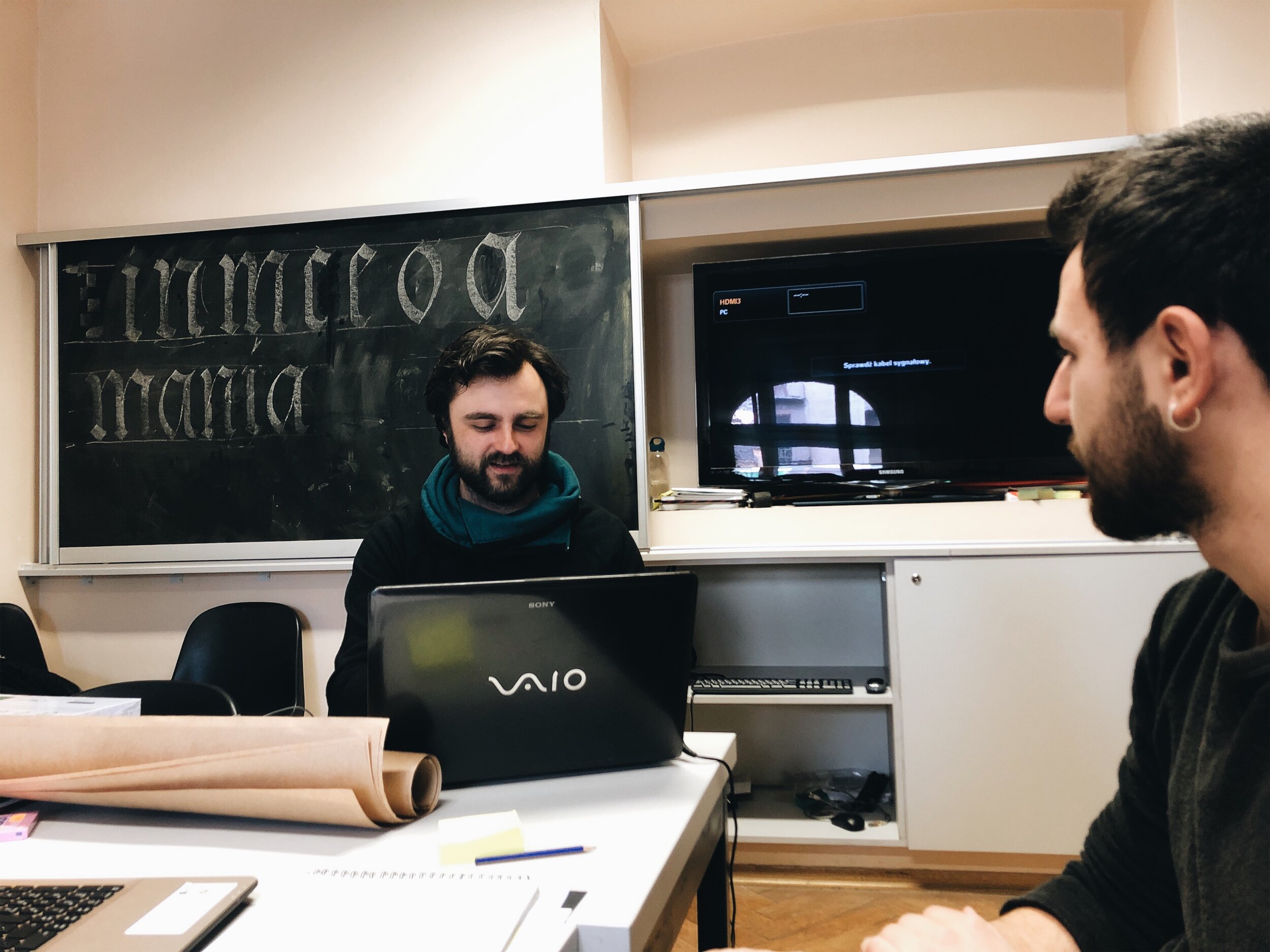
Created in the halls of Jan Matejko Fine Art Academy with Tunahan Zilyas, from Turkey, and under the supervision of Dr. Kamil Kamysz.
Art direction
Brand Idenitity
User interface Design
user experience Design
User testing

Research
Target Users
Our primary goal was to appeal to those under 30 who want to embrace the philosophy of “Why Not?”, but might be held back by lack of motivation or mental health conditions. As an extension of that, we wanted to leave room to appeal to people who don’t always struggle with mental health, but might have off days once in a while. Because our demographic was a younger user, we chose to create a mobile application to go with them on the daily and promote their journey in the world.
Empathy for the user
One of our goals with this app was to create interaction between the user and the outside world. In order to do this, we understood that a person’s mood dictates the amount of energy one has to head out to the world.
Because of this, we sought to create lists of quests based entirely on an empathetic understanding of the user’s mood for the day.


Gamification as Motivation
Inspired by the paper Does Gamification Work? — A Literature Review of Empirical Studies on Gamification, we aimed to use the concept of gamification to motivate consistent participation and engagement from users. Along with a Design Sprint, it gave us a good, rough outline of where we wanted the project to go.
Wireframing
The next step was to design the user journey while keeping in mind the goals and objectives of the project. With all the user research understanding, we were able to come up with various user flows. Using this, we quickly began creating wireframes to map them out.
User Interface Design
Art & Brand Direction
Color and typography were chosen to encourage the user to be bold and bring an air of positivity and energy in their interactions with the application. Because of the range of emotions we would be dealing with, it was important to select colors that didn’t force the positivity in a cliche manner (such as yellow) upon the user.
In addition to this, we were very purposeful in choosing typefaces within the Google Font database so that it could be accessible through different platforms and devices.
Usability Testing
INSIGHTS FROM USABILITY TEST
After conducting the tests, we reviewed the recordings of user interactions, making note of the success and failure of tasks. Here are our key findings -
Users would like an “+ Add Entry” button in the menu.
6 out of 7 liked the idea of material rewards as a driver.
Users would prefer a more minimal retainer for images on the “Explorin’” Page.
TESTING MY DESIGN
User testing was done by keeping our target users in mind. We created a questionnaire keeping in mind the outline of project’s goals, questions, and assumptions for the test. The user testing was done with 7 participants, peers ranging from 20 to 24 years old.
USABILITY TEST GOALS
User's ability to navigate the application.
Understand any frustrations/complications that users encounter in completing tasks.
Determine other features/improvements that might assist us in improving the goal of the application.
Final Takeaways
Given the time and effort we invested in this project, the overall outcome has been successful. If I had more time I would definitely like to work on designing a better more minimal ‘Explorin’ page that still incorporated a wave pattern of the brand identity in a different way. I also learned quite a bit more about minimizing typographic sizing and selection in a mobile design setting.
In addition to this, I increased my understanding how gamification could be used to solve the increase of mental health in our society. Overall, the projects gave me a decent orientation of the user-experience design process. Looking back, I know how I can more effectively streamline the process from idea to wire-framing and beyond.


