

Murder Mystery Party
Project Goals
In this branding project, we were to design promotional material for our client who was throwing a Murder Mystery Party that was inspired by Art Deco.
This project was created in the halls of Missouri State University and in collaboration with Jordann Wheatley and Lydia Linsenbardt.
Art Direction
BRAND IDENTITY
Signage


murdering cliches
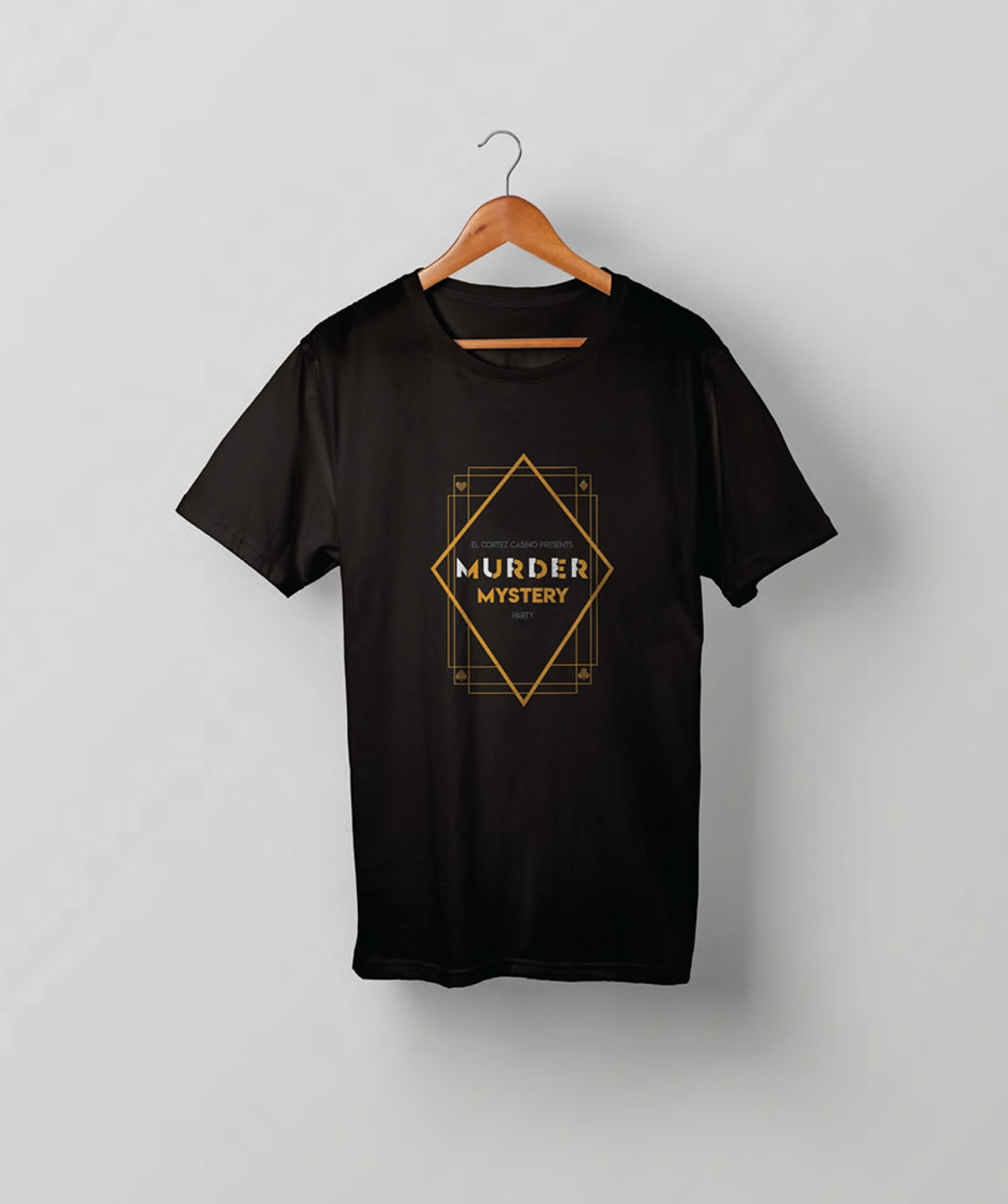
In approaching the branding of the event, we aimed to avoid the typical associations of murder that follow an event like this. This was vital because of the luxurious casino it’d take place in. Due to this, we chose to create an identity that would carry mystery throughout.
Interactivity
For us, the essence of a typical Mystery Party was of interaction. In creating the invitation & poster for the event, we wanted the person to participate in the decoding of the mystery from the very first exposure to the event materials.


COLORS
In selecting colors, we began searching for color combinations that would emphasize: the luxury of the casino and mystery. A golden color was chosen to reference the coins used at a casino and the gold chrome used during the Art Deco era. The purple blue shade was chosen to convey an aura of sophistication and mystery that is associated with an event like this.
TYPOGRAPHY
In typography, we chose to go with a single typeface family that consisted of sharp, Deco letterforms. In particular, we chose a sans serif so that it would read well applied like it was throughout the identity.