

Rays the Valley
Project Goals
In 2018, I began working with Rays the Valley’s parent company, Cynthia Ann Bakery to rebrand the company. Cynthia Ann was a Springfield-based start up that produces flatbreads and pizza crusts free of preservatives, gluten, dairy, peanuts, or sugar.
I began as a Marketing Intern and quickly began taking on much more responsibility. As a designer, I knew we needed to develop the brand farther than it had been as Cynthia Ann.
Art Direction
Brand Identity & Development
Web Design
Photography
Social Media & Marketing
The Name
Because Cynthia Ann Bakery was named after the founder’s late mother, it brought up deep sadness for the founder unnecessarily. In addition to this, we aimed to find a name that would encourage our customer in their health journeys. Thus, Rays the Valley was born.
Solidifying the Mission
The goal of Rays the Valley is to raise the quality of life of its customers through the brand’s gluten-free, low carb approach. The ingredients allow customers to overcome the challenges of taking their health back into their hands. Establishing this helped me in creating a brand that would truly resonate with our audience.

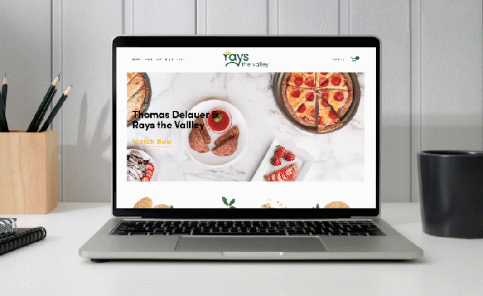
Web Design
From the beginning, I knew our website needed work. Because our product requires educating the customer, I knew a traditional, multi-page approach wouldn’t do. In addition to this, our statistics showed that the behavior of visitors was to visit the home page and leave, on the old site.
To counter this behavior, I focused on creating a scrolling homepage to show off the highlights of our mission and product. This allows the customer to travel easily through information that distinguishes Rays.


Photography
Because Rays functions as an E-commerce company, photography was vital in our approach. In taking the photography for our site, I searched to emulate a clean, airy feel to continue the branding of Rays.
Social Media = Existing Customers
When I started working with Rays, we began with an Instagram base of 11.1k followers. To alert customers of the name change, we sent out a postcard informing them of it. After working heavily on our Instagram and new branding and social media marketing, we ended with 29.2k followers in July 2019.


Colors
In selecting colors, I began searching for color combinations that would emphasize a few things: clean, positivity, and wellness. In my zvxc
Typography
When it came to typography, I consciously chose a single type family. This was done so that the type would be effortless, in the event that Rays didn’t have a designer present. It was important that the clean forms have the flexibility for softness and formality. With that in mind, Sofia Pro was chosen.