

Kempt.
Project Goals
FOR THE BEST YOU
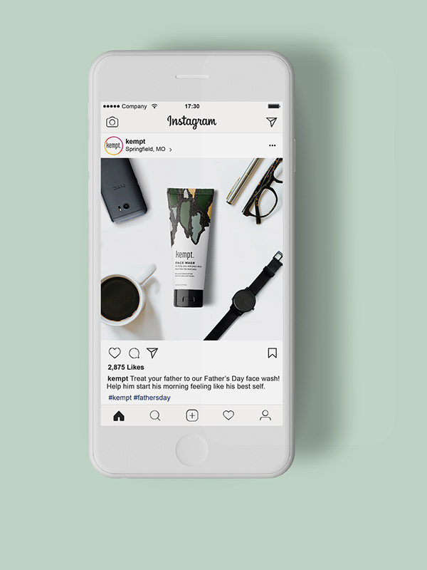
Kempt. invites all customers to feel strong and bold in their own skin through a a skincare system that simplifies hygiene for those with a busy life. The line is made to be inclusive of all genders.
Created in the halls of Missouri State University in collaboration with Kelly Grant.
Art Direction
BRAND IDENTITY
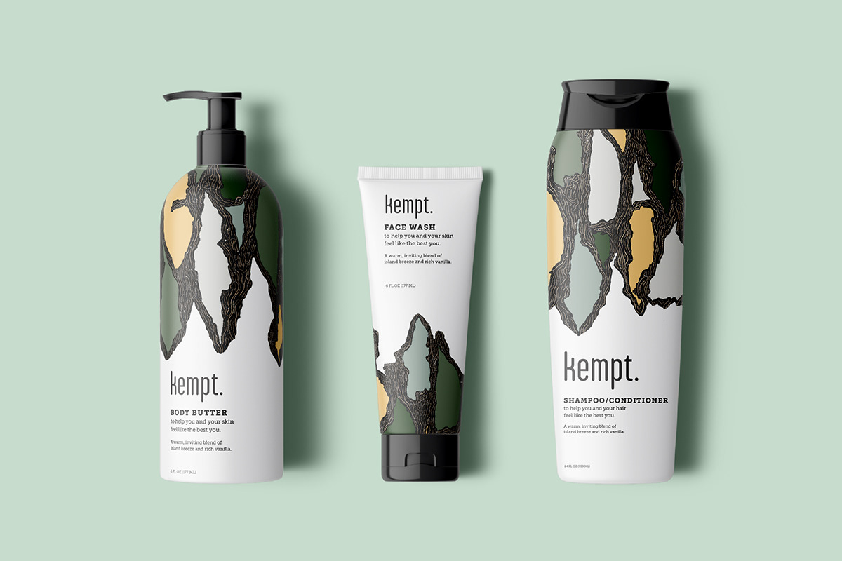
paCKAGING
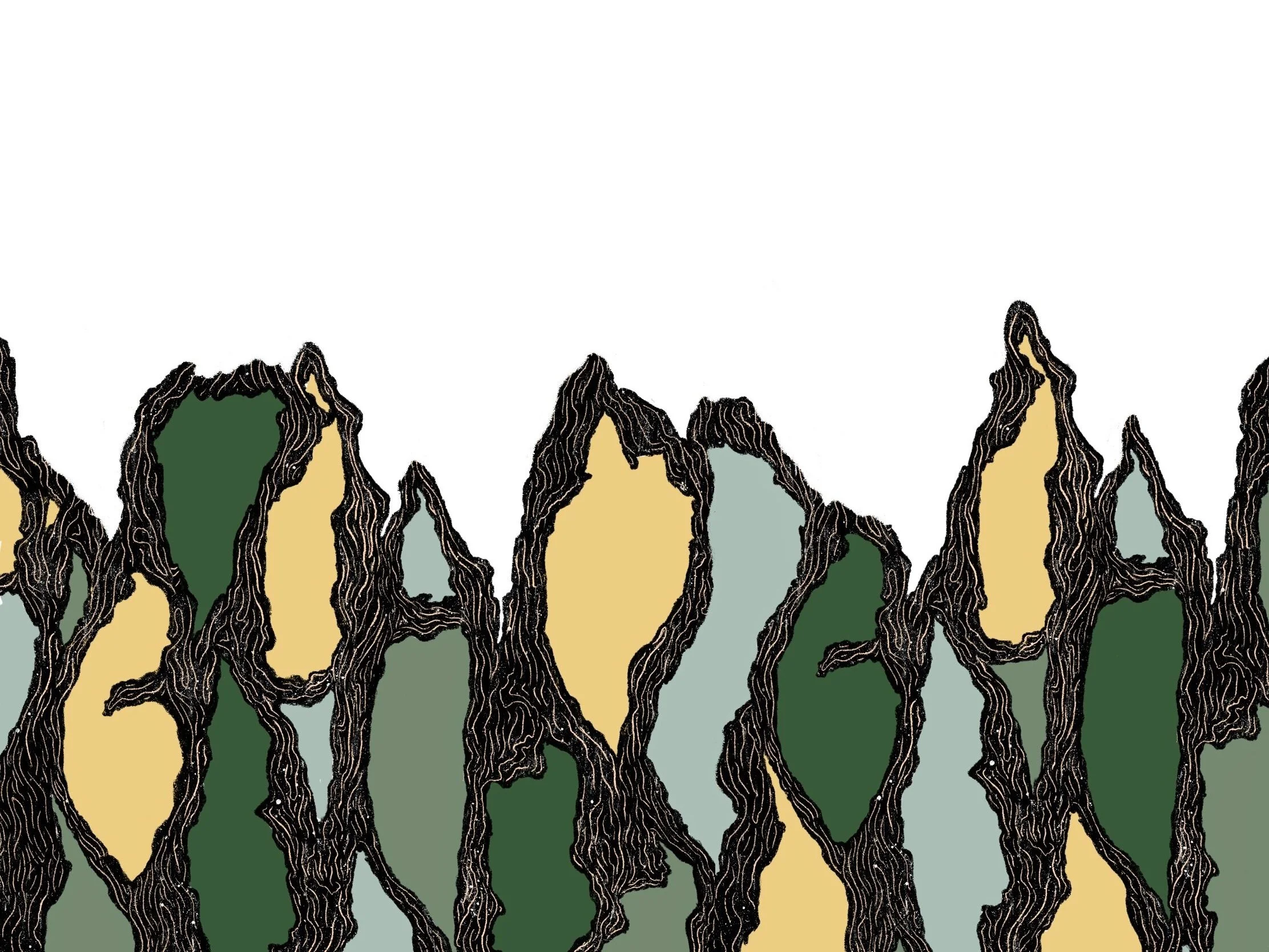


Lathering on Symbols
The aim was to create a minimal, yet visually appealing brand that would go in hand with the a person who would use this line of basics.
We were very much inspired by the palm tree and its symbolic meaning of victory and triumph. We wanted our customers to experience this same success when using our line of products.
To reference the idea of “washing” and cleanliness, we used the illustrated palm bark pattern to make it look like soap suds making way to the white space where the labeling would be.


colors
In selecting colors, we began searching for color combinations that would emphasize a few things: success, freshness, and minimalism. Continuing the symbolism of the palm tree, we chose to continue with green as our stand out color.
TYPOGRAPHY
When it came to typography, we were conscious to select a condensed typeface in order to symbolize the simplification of the skincare line. As a compliment, we chose a clean slab serif to further imply the idea of structure in the minimalism of the line.