Krakow Workshops
Project Goals
The aim of this project was to bring the Krakow Workshops out from the shadows into a new Polish Era.
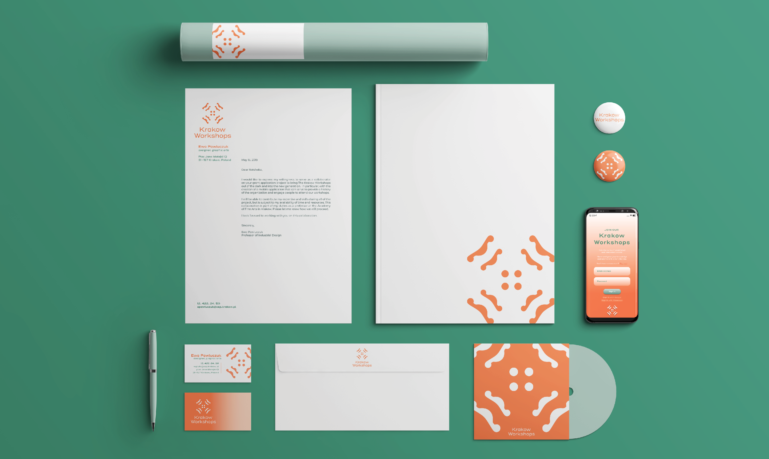
The primary focus of this project was to create a new brand identity. I expanded upon the original project to create the UI for a mobile application that would bring the Workshops into the daily lives of the next generation of Polish Artists in Krakow.
Created in the halls of Jan Matejko Fine Art Academy and under the supervision of Dr hab. Ewa Pawluczuk.
Concepting
Art direction
Brand Idenitity
User interface Design

TRANSCENDING THE SHADOWS
The Krakow Workshops was established in 1913 in the city of Krakow. It included: artists, architects, craftsmen, social activists, and some organizations Polish Applied Arts Society , aiming at raising the artistic quality of craft production. The association reached for methods of work close to folkloric art.
In 1925, the Workshops were well represented at the International Exhibition of Decorative Arts and Modern Industry in Paris, France. The artists of Workshops were included in the areas of architecture of the Polish pavilion, interior furniture, and most of the exhibits. Polish artists received a total of 189 awards in this exhibition.
Brand Direction
The radial mark of the logo stems from a piece created by artists from the Workshops, but has been manipulated to refer to the impact emerging from the original work of the Workshops. The use of gradients was employed to further the concept of emerging from the shadows.
Colors
In choosing the colors for this identity, I wanted to take into account that the end goal of the project was to create a mobile application. All colors were chosen stem from common usage within the Arts and Crafts Movement. Secondary colors were chose to compliment the Primary trio, keeping in a somewhat duochromatic color scheme.
Typography
Henderson Sans was chosen for its wide-set sans serif letters and juxaposition in form. The lack of serif suggest modernity, but the little flick of letters like R and K gives it the whimsy that is reminiscent of letterforms during the Arts & Crafts and Art Nouveau movements.
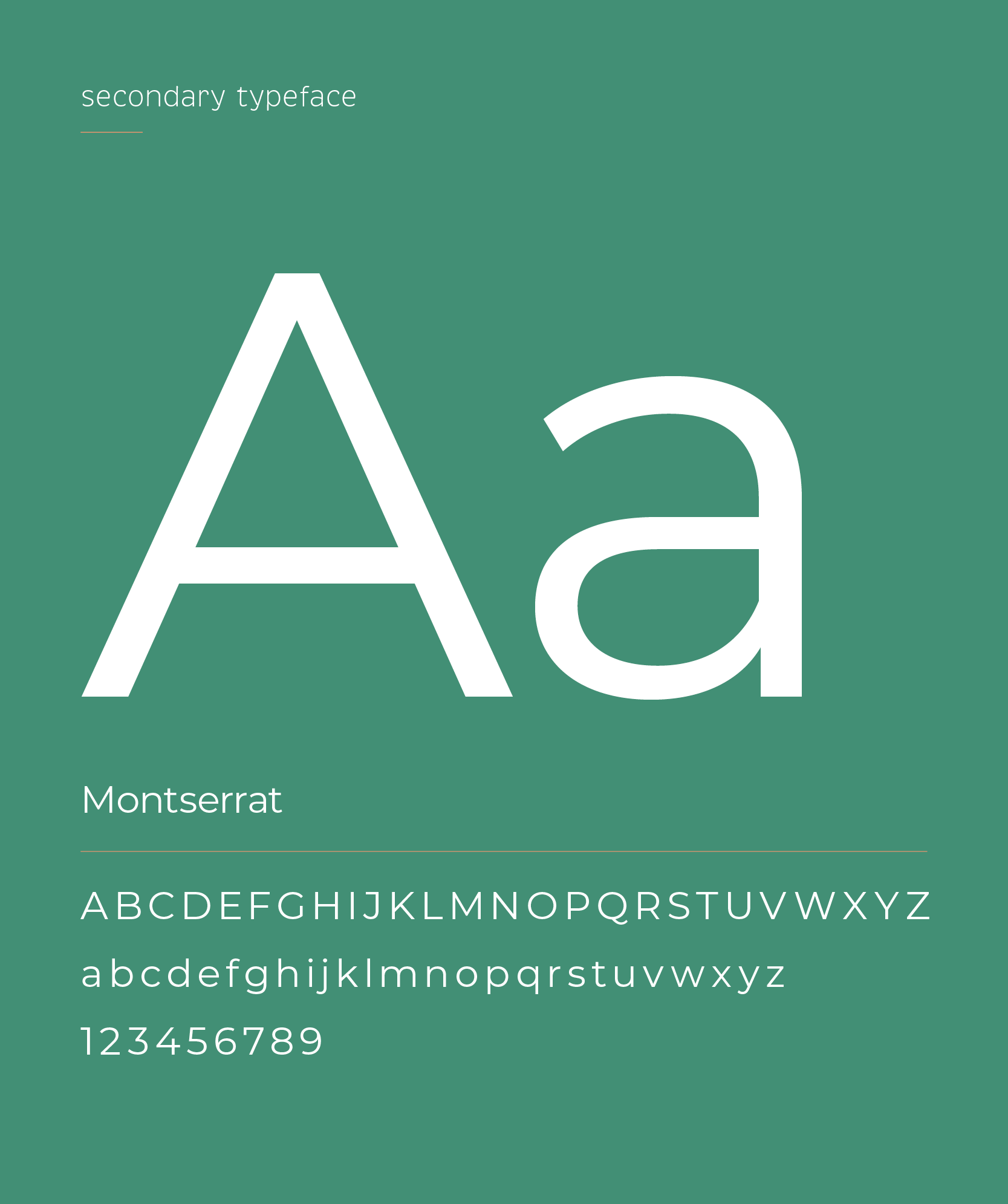
Montserrat, on the other hand, was chosen to provide a foil to the wide Henderson Sans. The typeface sits well in body copy, while Henderson is better for Headers and stand-out words.

Discover History
I had two goals in mind when approaching the UI Design for the Workshops. The first was keep true to the roots of the organization.
After the World Wars, the members spread to 10 countries & 15 cities which expanded their influence beyond the city of Krakow.
To highlight this influence, I created an interactive map in which users could click on cities and see the active artists in the area. From there, they could click on Artist Cards to learn more of their work and see other cities they were active in.
Workshops Continue
My second goal was to bring it into the new generation. In order to do this, I kept in mind the original goal of the Workshops: to aim at raising the artistic quality of craft production through the interaction between artists.
In order to do this, I focused on creating a Profile and Calendar feature in which users can sign up to upcoming events and workshops. They can also see which friends are signed up to events so that it promotes the event even further.


